Home Color Palettes 2026 — and How to Choose Art That Converses With Yours
The 2026 home palette moves between warm earth and botanical greens — but the palette alone is only half the work. The complete guide to connecting your home's colors with the art on the wall: the rules, the proportions, the mistakes.
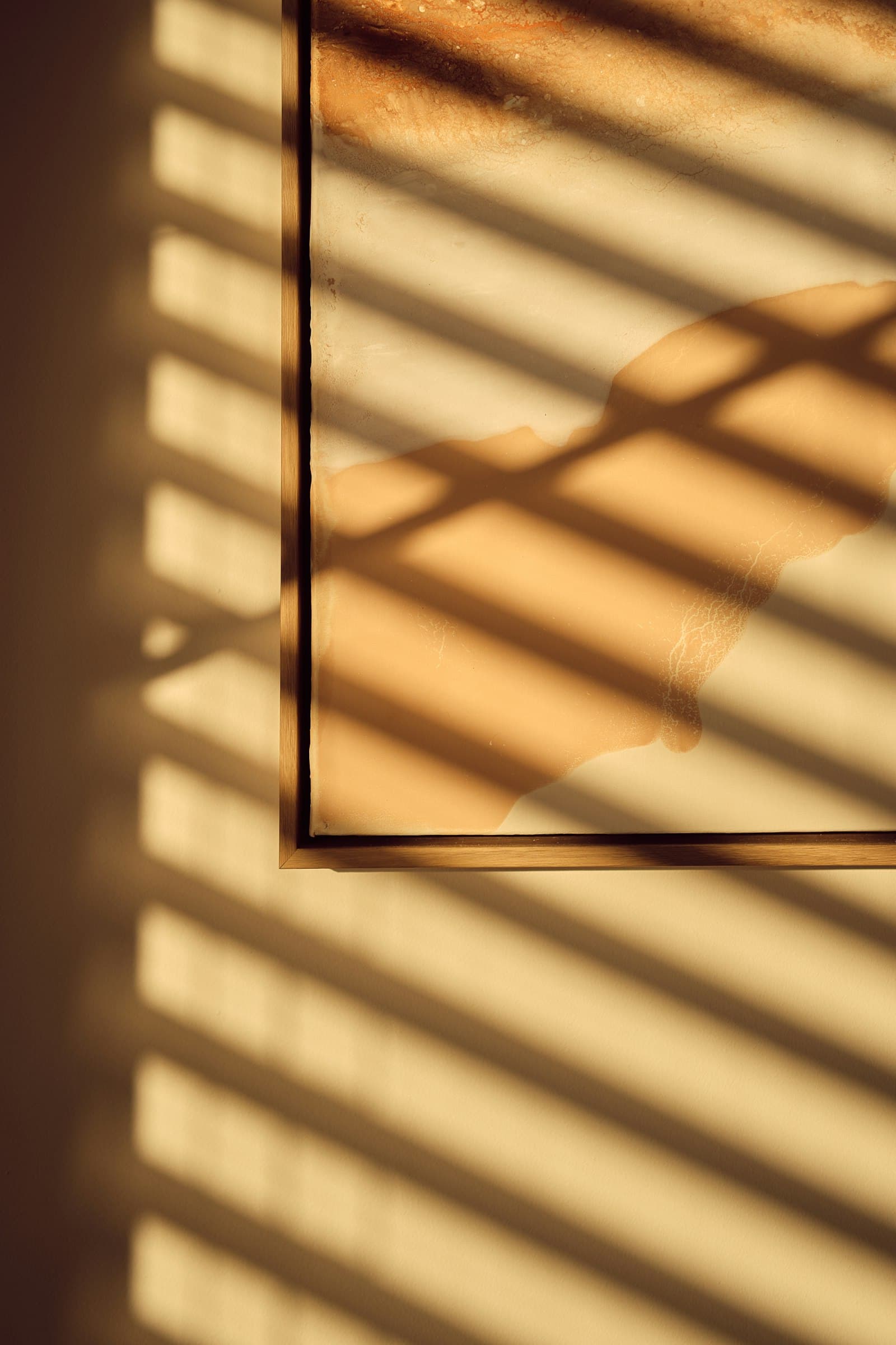
Every year the paint corporations announce a 'color of the year', and every year the question that actually matters goes unanswered: how do you connect the home's color palette to the artwork on the wall? Because the 2026 home palette — beautiful as it is — is only the scenery; the artwork is the soloist. When the two aren't in tune, even the most polished wall feels 'almost'.
This guide surveys the key palettes of 2026, then moves to the part most color guides skip: the practical method for matching an artwork to a palette — or building the palette around the artwork.
The Four Palettes of 2026
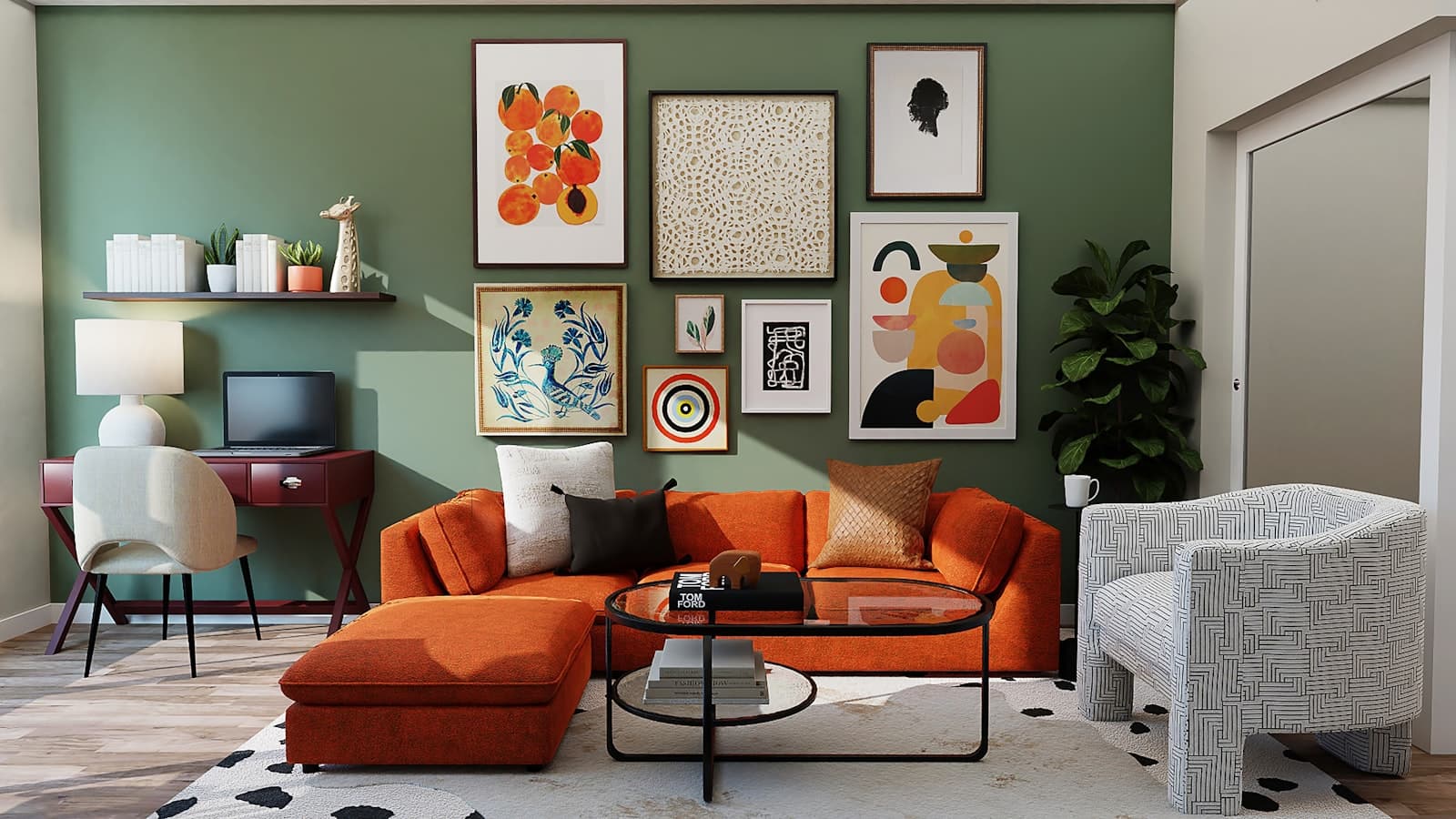
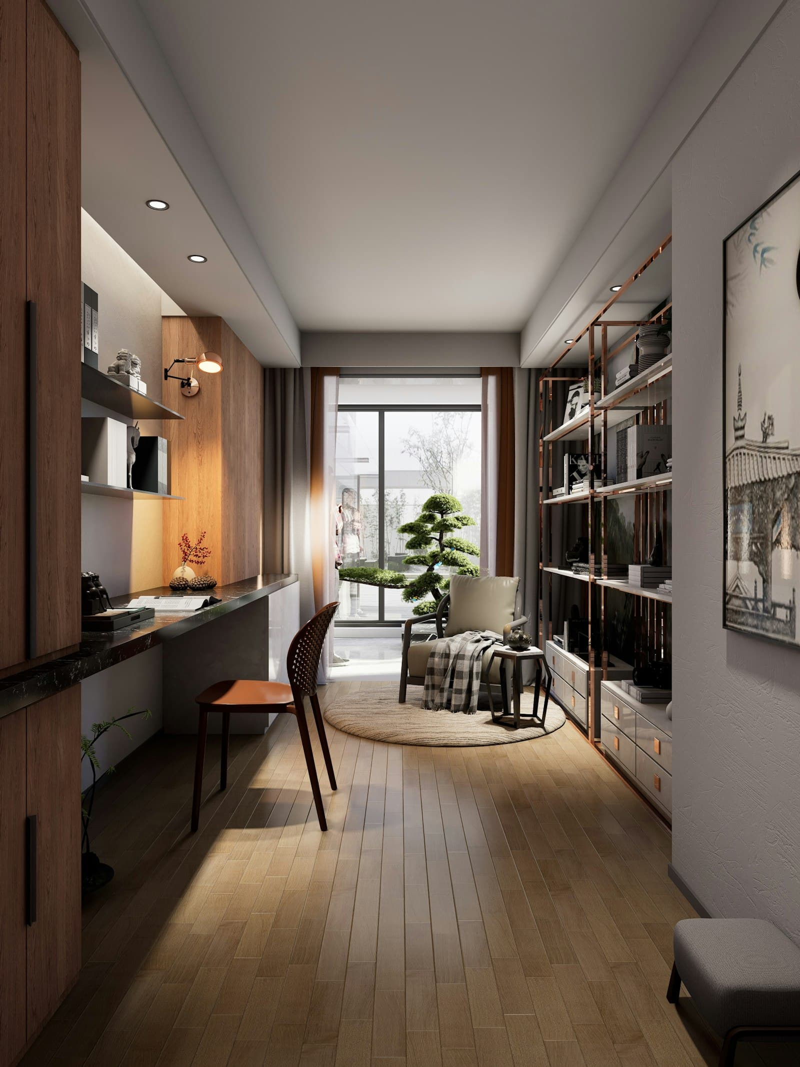
- Warm earth: terracotta, clay red, desert sand and cocoa brown — the year's dominant palette, warm and enveloping.
- Botanical green: olive, sage, eucalyptus and forest green — the natural continuation of bringing plants indoors.
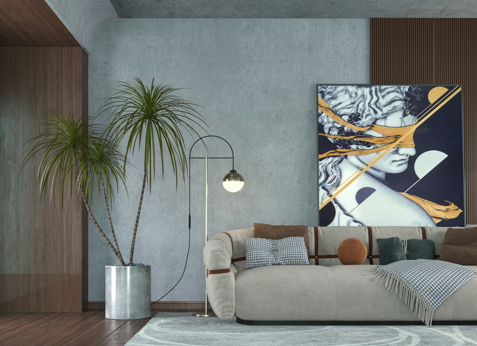
- Deep neutrals: cream, linen, greige and soft black — the quiet base replacing sterile white.
- Depth accents: burgundy, midnight blue and mustard — not for whole walls but for focal points: a reading nook, a niche, a door.
What they all share: depth and warmth instead of sterile brightness. The 2026 home gives up 'everything white and clean' in favor of tones that feel alive — and that's exactly what opens the door to richer art.
The Method: The 80/20 Rule Between Wall and Artwork
The principle interior designers work by: the artwork shouldn't 'match' the palette like catalog furniture — it should converse with it. The simple formula: about 80% of the artwork's colors live in the room's tonal family (earth-brown, botanical-green and so on), and about 20% deliberately break it — a blue patch in an earthy room, a touch of rust in a green one. That 20% is what turns a piece from 'pleasant' into 'speaking'.
A common, destructive mistake: choosing a piece in exactly the wall's color. A work that blends into the wall disappears — all that remains is a floating rectangle. You need tonal distance: on a dark wall, a piece lighter than it; on a light wall, a piece deeper than it. Contrast is what gives the artwork independent existence.
The walls are the sentence. The artwork is the word in bold.
The Reverse Direction: Building the Palette Around the Artwork
The truly professional work is done in reverse: first choose (or commission) the artwork, then derive the room's palette from it. Take three colors from the piece — the dominant one becomes the tone of the textiles and rug, the secondary one a wall color or a statement piece of furniture, and the rarest goes to small accessories. The artwork and the room are born from the same DNA, and the result feels planned at the level of an architectural project.
And when working with an artist on a custom piece, you can skip the guesswork entirely: clients attach to their walll.art brief photos of the room, the furniture tones, even the wall's paint-fan number — and artists submit proposals whose palettes were built around this specific home. Each proposal is visualized on the actual wall, so the conversation between the colors is something you see with your eyes, not imagine.
A last word on fashion: palettes change every few years; a good artwork stays. Keep the 'trend' in colors that are easy to swap — wall, textiles — and choose the artwork to endure even after the wall changes tone. A piece with a rich, complex palette survives three rounds of repainting; a fashionable single-tone piece survives one.
Questions & answers — Home Design
What is the leading home color palette for 2026?
Warm earth tones — terracotta, clay red, sand and cocoa — lead, alongside botanical greens like olive and sage, deep neutrals instead of sterile white, and depth accents like burgundy and midnight blue in focused spots.
How do you match a picture to a room's colors?
By the 80/20 rule: about 80% of the artwork's colors from the room's tonal family, and about 20% a breaking color that creates tension and interest. Keep tonal distance from the wall itself — a piece in exactly the wall's color simply dissolves into it.
Does the picture need to match the sofa's color?
Not match — converse. One tone in the artwork echoing the sofa is enough to create a connection, and the rest is free. Overly complete matching creates a flat, catalog look; a color dialogue creates a space that feels genuinely designed.
What does building a palette around an artwork mean?
It's the professional method: choose the artwork first, then derive three colors from it — the dominant for textiles, the secondary for a wall or furniture piece, the rarest for accessories. The room and the artwork share one color DNA and the result feels planned from the ground up.
How do you commission a piece that fits the home's colors exactly?
Attach to the brief photos of the room, furniture tones and even the wall's paint number; artists submit proposals whose palettes are built around your home, and each is visualized on the actual wall. The chosen proposal arrives as a work created for the space.
Should you choose art in fashionable colors?
Keep the trend in easy-to-swap layers — wall paint and textiles — and choose the artwork for the long term. A piece with a rich, complex palette keeps working even after the wall changes tone; a fashionable single-tone piece ages along with the trend.