Color Psychology in Home Design — How an Artwork's Colors Change How a Space Feels
Blue that calms, terracotta that warms, green that balances. The colors in the artwork on your wall shape the mood of a room more than any piece of furniture — here's how to choose a palette that works for you.
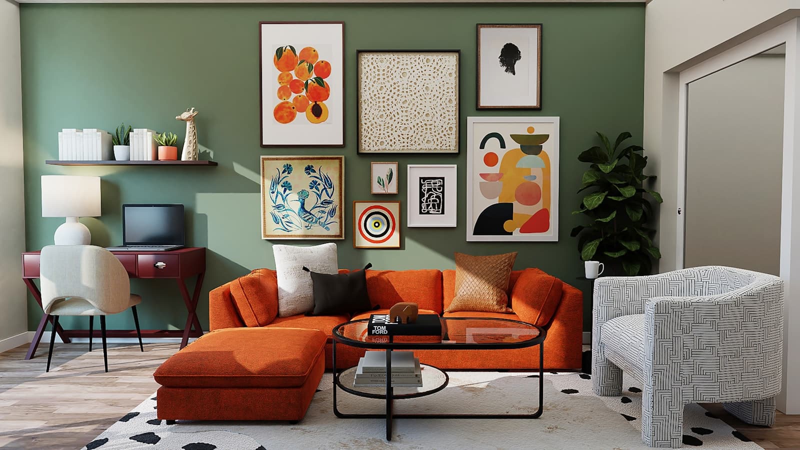
Try to recall a room where you felt truly calm — a café, a hotel room, a friend's living room. You probably don't remember the furniture, but you remember the feeling. A large part of that feeling is color: our brain responds to the hues around us before conscious thought has a chance to intervene. Pulse, muscle tension, even the sensation of temperature — all are shaped by the palette surrounding us.
And this is where artwork comes in. Unlike painting an entire wall, which is a major commitment, a piece on the wall is the most focused and flexible way to bring color into a room: it concentrates the palette in a single focal point and sets the emotional tone of the space without changing a single wall.
What Each Color Family Does to a Room
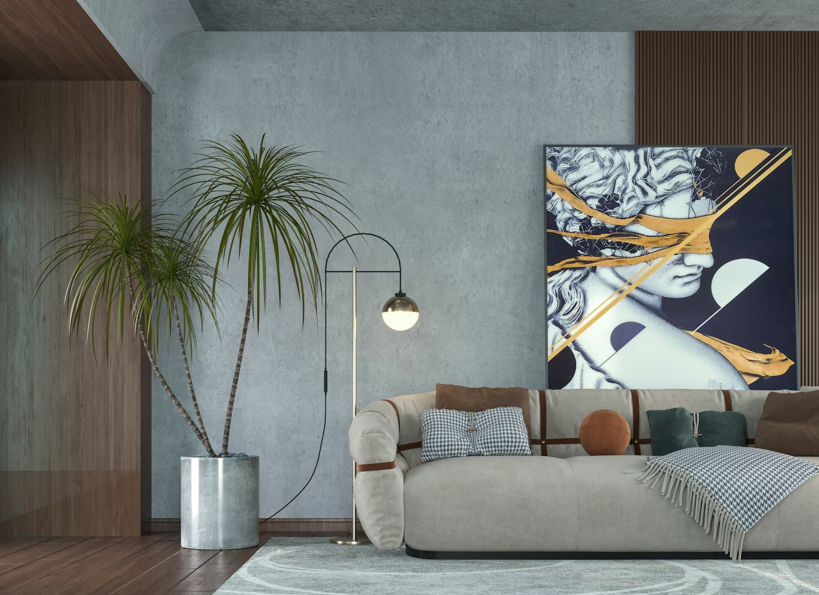
- Blues: lower the pulse and instill quiet. Excellent for bedrooms and work corners that demand focus; in deep shades they also add depth and luxury.
- Greens: the color the human eye reads most easily. They balance, refresh, and connect the space to nature — a safe choice for almost any room.
- Terracotta, clay, and ochre: human warmth and groundedness. They turn large, bright living rooms warm and inviting.
- Yellows and oranges: energy and optimism, in moderation. Wonderful in a dining area or kitchen; tiring as the dominant color in a bedroom.
- Reds and burgundies: intensity and appetite — no coincidence that restaurants love them. At home they work best as an accent within a piece, not as a dominant field.
- Greys and blacks: framing and drama. A good monochrome work gives a colorful room a quiet anchor and sophistication.
Temperature: The First Law of a Home Palette
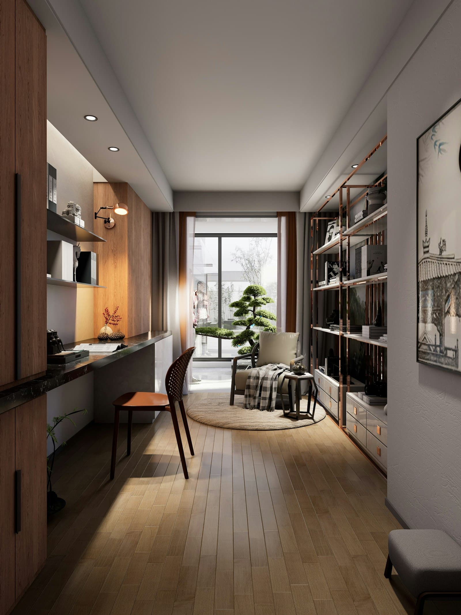
Before choosing a specific color, identify the room's temperature. A room with lots of wood, textiles, and warm tones will benefit from a piece that continues the warmth — or, conversely, from a single cool work that balances it. A white, minimalist room with cool northern light can feel sterile; a piece in terracotta or ochre tones will thaw it instantly. The rule: the artwork can continue the room's temperature or balance it, but it must not ignore it.
The 60-30-10 Rule — and Where the Artwork Fits In
Interior designers work by a familiar split: 60% of the room in a quiet dominant color (walls, floor), 30% in a secondary color (large furniture, curtains), and 10% accent color. The artwork is the perfect candidate for those ten percent: it can carry a bold hue you'd never dare paint a wall in, giving the room its spark without risk. And if you want to refresh the room in five years — you swap an artwork, not repaint a house.
A painted wall sets the backdrop. Art on the wall sets the mood.
How to Build a Precise Color Brief
When commissioning a custom piece, the color description is one of the most important parts of the brief. Instead of “something colorful,” try this: name two or three shades already present in the room (rug, cushions, the wood of the furniture), define the desired feeling in a word or two (“calm,” “homey warmth,” “clean energy”), and note what doesn't suit you. Those three sentences give artists a precise frame without strangling their creativity.
Light: Color's Silent Partner
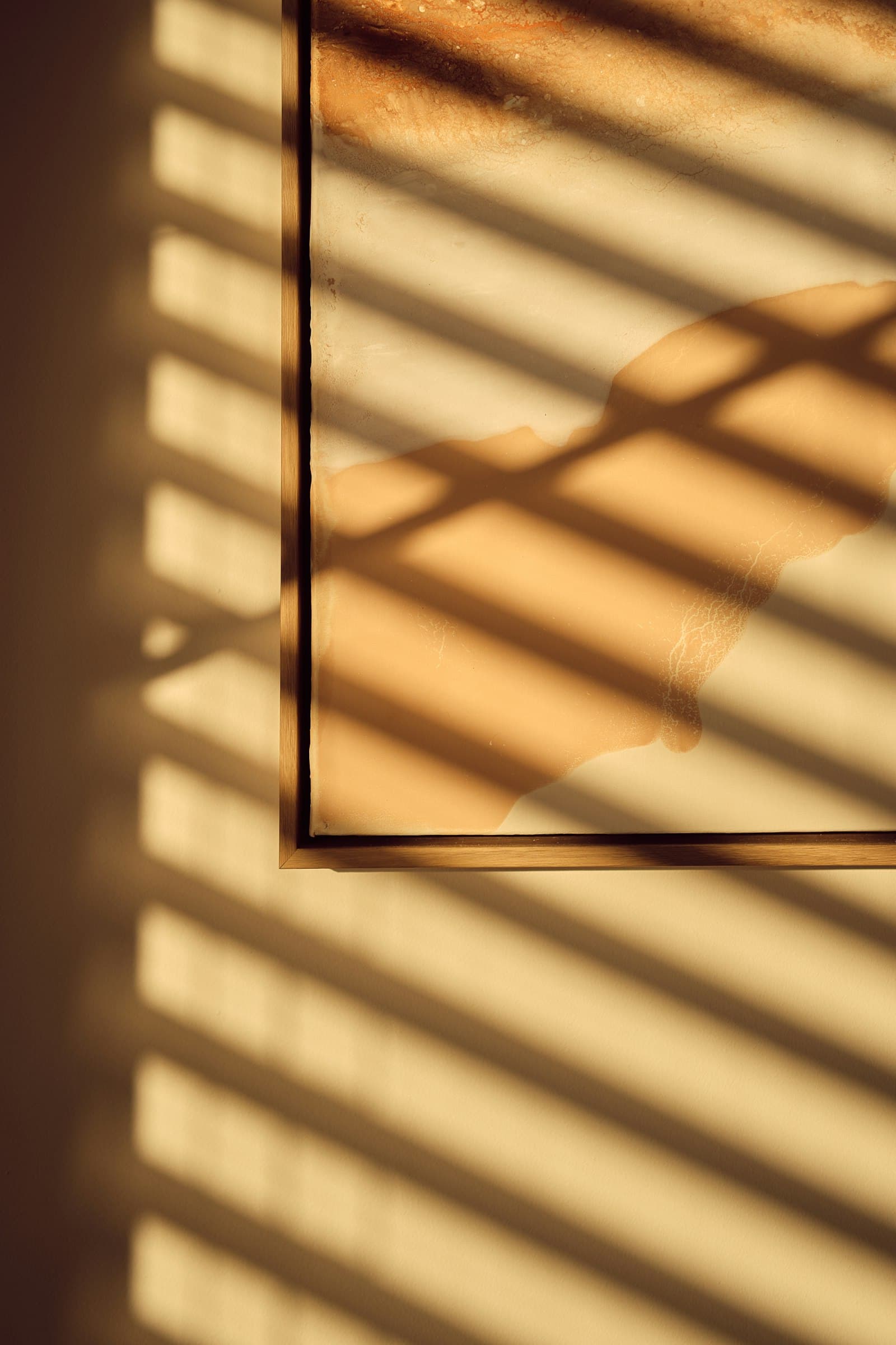
The same artwork will look entirely different in a room with strong southern light and one with soft northern light. Warm light (incandescent lamps, sunset) amplifies reds and yellows; cool light strengthens blues and greens. That's why it's important to photograph the wall at the hour you actually spend in the room — evening in the living room, morning in the kitchen — and note it in the brief. An artist who knows the piece will mostly be seen under evening lamplight can tune the palette accordingly.
In the end, color psychology is not an exact science but a compass. The right color for your room is the one that makes you breathe deeper when you walk in. Visualizing the piece on your actual wall, before ordering, is the surest way to make sure that's exactly what happens.
Questions & answers — Home Design
Which artwork colors suit a bedroom?
Cool, calm shades — blues, smoky greens, and soft greys — support relaxation and sleep. Avoid dominant reds and oranges in a bedroom; they stimulate and make it harder to wind down at the end of the day.
How do you choose artwork colors for an existing living room?
Identify two or three shades already in the room — in the rug, the cushions, or the wood of the furniture — and choose a piece that picks up at least one of them. That way the artwork feels like it belongs, even if the rest of its palette is entirely new.
What is the 60-30-10 rule in design?
A common color split: 60% of the room in a quiet dominant color, 30% in a secondary color, and 10% accent color. Artwork is the best way to carry those ten accent percent, because it concentrates bold color in a single focal point that's easy to swap.
Should the artwork match the room's colors exactly?
Not exactly — and better that it doesn't. A too-perfect match feels like a catalog. The good rule: one shared shade connecting the artwork to the room, alongside new shades that add interest and depth.
How does lighting affect an artwork's colors?
Warm light amplifies reds and yellows; cool light strengthens blues and greens. Photograph the wall at the hour you actually use the room and note the lighting type in the brief, so the artist can tune the palette to the real conditions.
Can I ask an artist for a specific color palette?
Yes. In the brief, note the desired shades, the feeling you're after, and what doesn't suit you, and the artists submit proposals within that frame. Visualization on your wall photo lets you verify the palette works in the space before ordering.